How To Write a Non-Fiction Book Proposal
Before You Write: Formatting Guide
Agents and publishers read A LOT. More than you or I could ever read in ten lifetimes. Because they get so many submissions, they are, and have to be, speed readers, trained to zero in on the good stuff. It’s important to make the reading of your material as easy and eye-friendly as possible for them. If you submit something in the wrong font or format, your work is more likely to see the trash can than anything. It’s not petty, it’s just good manners. You don’t like when people email you IN ALL CAPS, right? Same thing.
Here’s how to format your proposal to perfection:
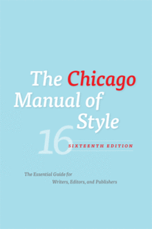
Chicago Manual of Style
Before you write a thing, make sure you have the right style guide. You probably learned MLA format in school. Forget it. Book publishing uses CMS, the Chicago Manual of Style. Get a copy used or new on Amazon (it’s about $40), but get a copy so you know what needs to be italicized, bolded, or underlined, and you don’t leave out any commas.
One of the biggest takeaways from CMS style is the use of serial commas, also called the Oxford comma. It’s basically just throwing an extra comma before the and in a series list. So instead of “red, white and blue,” it would be “red, white, and blue.” Not that important in life, perhaps, but a serious matter to copy editors.
You’ll have a leg up on writing your full manuscript if you start writing everything you do in CMS style now. Go back and add the extra commas to your blog. It’s worth showing a future editor that you can hit the ground running.
Fonts & Format
You should write your proposal in Microsoft Word; you can save it either as a .doc or .docx (Apple format). Most people in the publishing world use Macs, but they can open both.
There is only one acceptable font for writing your proposal (or manuscript or anything else you ever submit professionally): Times New Roman, font size 12. Don’t try and be cutesy with your font choice. Editors are not into cute. They are into easy-to-read since they read thousands of pages a week. Do their eyes (and sensibilities) a favor, and only use Times New Roman.
Use bold and italicized styles sparingly, except when it comes to your book’s title. Every time it appears, bold it: The Official Downton Abbey Cookbook. No need for quotes or italics for your own title.
Use exclamation points exceedingly sparingly!! They are very annoying! Especially when overused!!! We get it! You’re excited!!! But the exclamations points actually distract from the power of your words!!!!
Be enthusiastic without using obvious hyperbole. And don’t forget to use delicious words. You want a reader to be able to taste and smell your proposal.
The entire proposal should be double-spaced, no exceptions. Your first initial and last name along with the page number should appear in the upper right corner (put them in a header file) of every page except the cover.
Paragraph Style
Now I know I said to use Chicago Manual of Style, and that still holds true, but every publisher also has their own in-house style manual based on how they typeset. Some of them like you to use a tab indent to start a new paragraph; some hate tabs and want everything aligned left with a double space in between paragraphs. You’ll receive a copy of their style guide when they sign you (if you don’t, ask right away so you don’t spend hours reformatting your manuscript the night before it’s due!). Until then, pick whichever paragraph style you like; both are acceptable for proposals.
Tone & Voice
In their post “From Blog to Book,” the editors at Chronicle Books give this (great) advice on tone: “Write a formal business letter meets email to your best friend.” Your proposal needs to follow a fairly strict format and adhere to all grammar and punctuation rules, but also give a sense of your spirit and personality.
And while it might seem awkward at first, use third person and last names only throughout your proposal (except for the sample chapters). I’m embarrassed enough saying, “I’m a great writer!” but in a proposal it’s: “Maclean is an excellent writer.” Weird but required.
>> Next: The Cover Page
Leave a Reply